Final Major Project
Final major project
This page is for my F.M.P , in this I am to explore multiple Ideas with in dept research to create one final piece. This will be final project will count for my final grade.
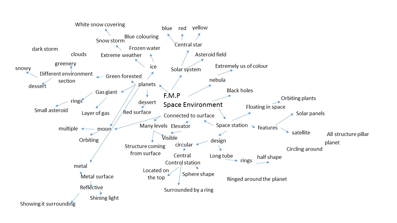
F.M.P mind map
The mind is used to explore all range of idea I could used for my F.M.P


The 10 idea that interest me are that i pick from my mood board


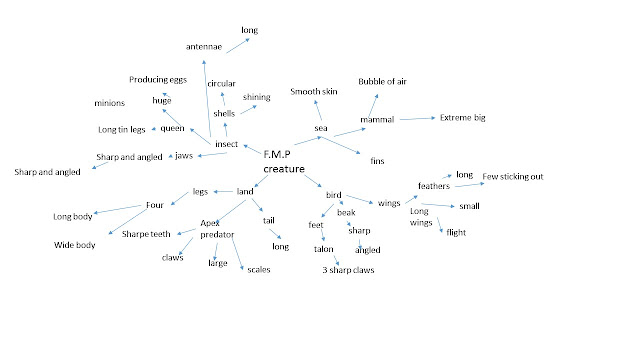
 exploring all the 10 idea that interested me to look what I can do for each one and while going through them it has help to narrow down to which I find the most interesting.The one I found the most interesting are


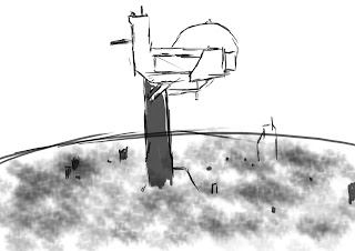
underground layer silhouette


 futuristic soldier sketches


 Mike.S.Miller is comic illustrator and writer as well as founder of organisation called Alisa Enterprises, he is also know for hes work in popular comic book series called Injustice for DC.In the Injustice series the character he paint I notice that the armour that they stand out because usually we see the suit with only pads and recess lines which I find eye catching.So I plan to follow he art style in the injustice series.
Injustice series Gods Among Us

The Injustice series is a DC comic released in January 14 2013 written by Tom Taylor and art done by Mike.S.Miller and has over 200 chapters.The comic is about High moral superhero knows Superman losing his morality and becoming a tyrant after he was tricked into killing his pregnant wife and the story still continue to day.I plan to follow this series art style because on how the armour set for character are design to look eye catching.
Half Mask
 The first known half masked where the Masquerade Mask, the Masquerade original where worn when attended the masquerade ball in 16 central renaissances Italy.there were different type of masquerade mask, the Colombia mask is a Half mask that cover
the eye, cheeks and somethings the nose.Half mask today can also be know for cover the bottom half of the face to used for respirator.Half mask are made from different material, during Masquerade times the mask where made from hand and technique was used were paper was soaked in glue and then layered.Sometimes the mask made from leather, wax or valet and then decorated by artist using feathers , jewels or other materials.

 Cowl are large loses Hoods that cover the head and neck.they made out of kited wool to protect the person neck and head from the cold.Cowl also has religious use as they where worn by monk as apart of there robs during medieval times.the monks cowl was made from medium weight cotton and they are fasten with a close front. However ever cowl mask like those worn by character such as batman or daredevil used to protect the face and counsel their identity,but with the mount area still revealed.
 Hoods are found on sweatshirts,Jacket and other tops, the first Hood was created in 1930 by Champion product when the company began experiment with fabric and then produce the first Hood.Hoods are made from heavyweight cotton but some are made from a nylon fabric that help keeps in the warmth.Hoods are main purpose to proved warms like a jumper however Hood come with a hood also proved warmth to the head.
 Chest plate it is a piece of amour that cover the chest and the back in medieval time it was know as a Cuirass. Chest plate only cover the top half of the body and where supported by straps that went above the shoulder and around the body.Chest plate amour insure that the person wearing it would not receives struggle when bending there body but sometime chest plate armour can extend to the stomach. Historical Chest plate like during medieval time, knights chest piece were created from steel and iron to protect against arrows, swords and lances but other material are used such as leather and fabric.Modern chest plate amour can be made from Kevlar or carbon fibre because Kevlar and carbon is very resistance and light for solider to wear.
 Armour plats are metal covering that are used on both people and military vehicle to protect one in combat, they come in different size and materials.Modern day amour plats can be found in body armour made from Kevlar and used to protect from firearms.Armour plats also comes in steel and iron but they only for vehicle because the steel and iron can be heavy, during medieval time knight armour has made from steel armour plats which weighed 110 pounds.
 Shoulder plates are small protection pads located on the top of the shoulder and overlaps around the shoulder to cover the front and back of the shoulder.They are made from metal , leather and modern day Kevlar and be made as singular plates or multiple plates that extend down the arm.Shoulder plates and held in place because they attachments to the chest armour or they have straps that go around the arm, the straps do not wrap around the arm pits because it would cause irritation.
 Elbow and knee pads are padding that offer protection that is also used in normal people as well as the military. People used the padding to protect their elbow and knee when riding bike or motorcycle
because your knees and elbow have thin layer of skins comparing to other layer of skin around the body so padding are there to reduce the chances of being injured.The padding are very similar to the shoulder plates because they both made from similar material and held in place by straps.These pad can also come as metal plate and can extended armour attached that goes down to the feet or wrist
Elbow and knee pads are padding that offer protection that is also used in normal people as well as the military. People used the padding to protect their elbow and knee when riding bike or motorcycle
because your knees and elbow have thin layer of skins comparing to other layer of skin around the body so padding are there to reduce the chances of being injured.The padding are very similar to the shoulder plates because they both made from similar material and held in place by straps.These pad can also come as metal plate and can extended armour attached that goes down to the feet or wrist
 arm guard are protection that cover the top of the wrist they are commonly made from leather or plastic. They where worn by arches to protect their skins and form arm against injuring when pull back on the sting of the bow.They also called arm gauntlet which is very similar to the arm guard but protect against other attack that come from blunt or sharp weapons and they are commonly used by foot soldiers.
 A Utility belt is belt that container main equipment and weapon used by the person, the storage capability of utility bet use is the same design as a pouch.these belt are used by police and construction works to carry there equipment around while they work.
 The holster was design for holding small firearms like pistol and was know as a Buscadero. The most reconsider holster are from western cowboy which were made out leather for people who held firearms
 Cape to day are worn as costumes for fashion how before they were more symbolic to show power.There is now precise date to know when the first cape appear.But it is know that they been around for centuries and evolved through the years.Cape were used for mainly different things, monks would wear them but with a hood, some wore long caps to protect their feet from the wet.
 A Munitions pouch are small pouch that can place around the body either on the belt or vest, they are design for storage that do not require you hold with your hand however they small and have a limited storage space. Munition referee to ammunition or explosive which is why they main used by military infinity, the first noted pouch was in 1958
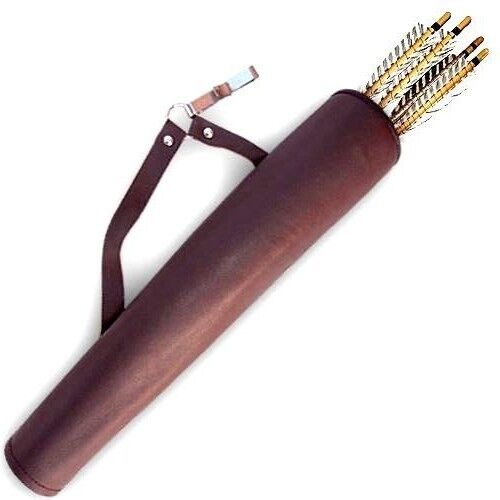 A quiver is a container for holding arrows and there have been many type of quivers through different culture and countries. Before the quiver the English Long bowmen and several other cultures used a arrow bag which was a cloth bag other versions of quivers were made from wood, fur and leather before the use of metal and plastic.In modern days the quiver are used for hunting and are able to steady carry different types of arrow with encumbering the hunter.
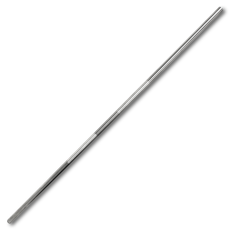
 The first bow and arrow was invented in Africa around 64,000 years ago, made from a thin wooden shaft and a sting.The way the bow is that the pull back from the sting creates tensions and once the sting is released it create momentum for the arrow to propel.Arrows have a thin circle body to make them aerodynamic and fenders are added to them so they remain stead in the air.The arrow head it self dose the main damage because of its Sharpe head.
 The bow staff is a low tub made from wood or metal and can be long as the body because of that it has a longer reach then other melee weapons.The bow staff originated in Japan in 1600s with a length of 1.8 meters and was in used many different forms of Japaneses material arts.Bow staff are still used today and have been modernised by becoming thinner and made out of metal and are able to folded into a more smaller tube.
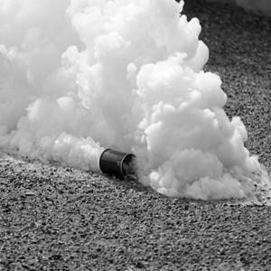 Tear gas is non leather chemical weapon that used during riots, the gas is not a gas, it is an aerosol causes pain towards the eye, irritate the skin and could even blind.it was developed in 1928 in America
 Throwing knives are originated back to prehistory but also was recorded in us Egypt in 1300 B.C, throwing knives are bladed knives that can thrown of over a distance. Although a normal knives can do this a throwing knife is more flat more aerodynamic.
 A grappling hook is hook attached to a rope and can be launch over a distance, the rope is used to attraction a line from the target it hit to the grappling launcher.The know grappling hook were by the Romans to be used by there Navy to hook ships so their soldiers can board ships.But these were large hooks modern day grappling hook are smaller and uses gas pressure to launch the hook over large distance with out cause too much damage.

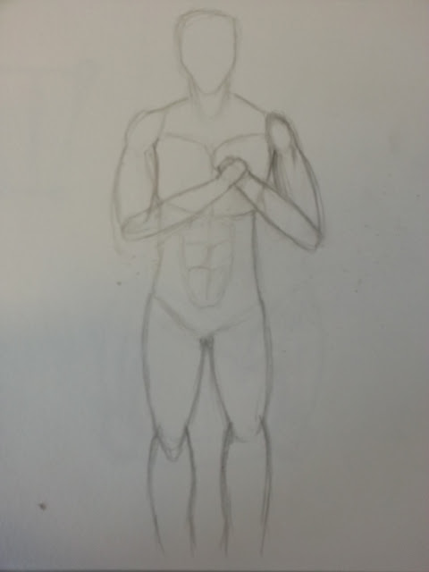
 To day learnt because I am doing a charterer and I needed to be familiar with human anatomy I used.the body needed to be a muscular form because the superhero vigilante have strong molecular form bodies.
Human Antony practice
This guide to help be practise. vigilante usually have strong, muscular figures and I have practise giving the legs, arms and torso muscles.
The guide I used showed me that I should first start off with thin line to show where my are going to be but when Before doing the line I create a large circle to represent the shoulder.then draw the line to represent the upper arms then stop when I reach the elbow then draw a smaller circle.Repeat the same process for doing for the lower arm, then I needed to do the shape of the arm.Started from shoulder circle connect it with the elbow circle with curved line, the side that point away from the body should be more straight then the side point towards the body


I use this technique to do my body and following I feel more confident with on how I draw human body.
https://destinyfall.deviantart.com/art/Basic-male-utter-body-tut-84839144


This is an old camera which I used to as a base structure for a grappling hook that is most commonly used be vigilante superhero that don't have another fly capability.


I combine the the two pros using the camera as the base shape for the grappling hook and then using the chain hooks as the hook it self.


next I experimented with shoulder pads, the first one cover the hole top of the shoulder the rest can be can be seen mostly on the side of the shoulders
Experimental sketches on shoulder plats

these are my mask experiment for my vigilante mask are key for crime fighter because it help protect there identity.I did types of mask:full head cover, cowl,bottom half and eye mask.
Experimental sketches on mask


For the top eye mask I used observation drawing skills to sketch this glass lenses then apply the base frame.

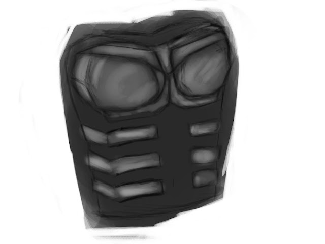
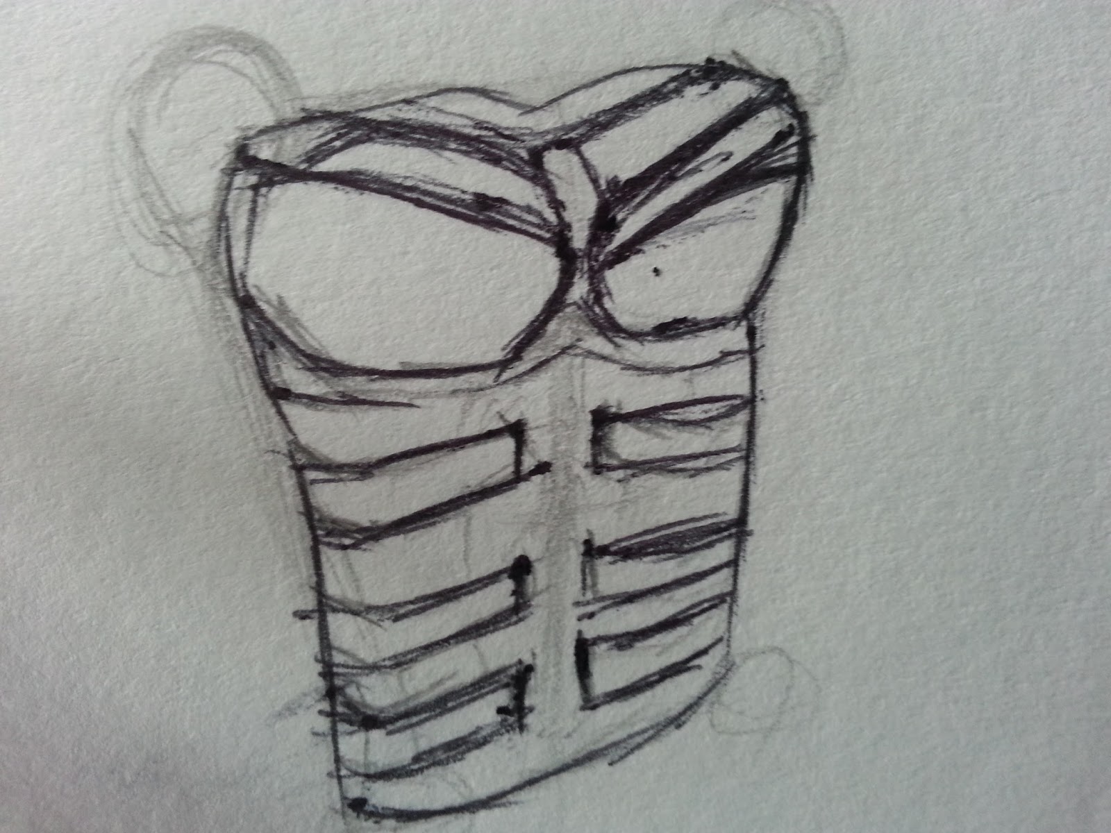
Experimental sketches on chest piace
my concept character suit will have an under layer, that under layer will normally be form fitted , which means it will be thigh that why we see the abs of a character in comic books.But sometimes we see that live action that the character suit has built armoured plates, that are place inside between the clothing, Other times they are attached on the outside of suit and are exposed.The amour can be from from a Kevlar or other dense material.
I choice to do armour sets because vigilante need some form of protection in which thigh and spandex can not give. Protection is needed from them because crime fighting is dangerous and can offer fire arms and other weapons are used,so with the uses of Kevlar armour the character could be easily killed.only movies and people cosplay spandex and other material like latex because they are thigh and easy to obtain unlike material like Kevlar.


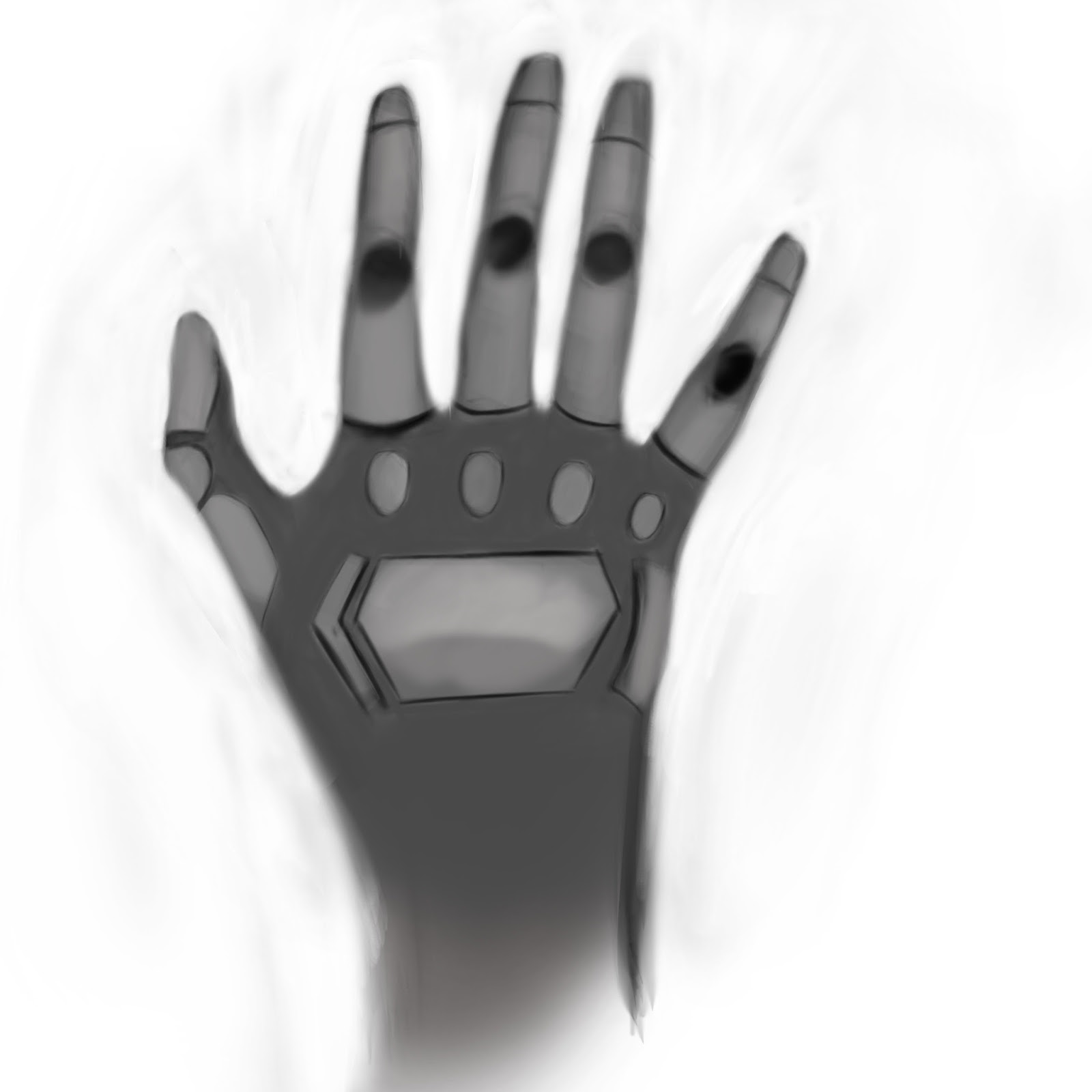
Experimental sketches on gloves
The gloves can come with small little padded protection.


Experimental sketches on Arm gauntlet
these arms guard will cover the wrist and can stretch from the hands to the elbow


The most common plate that is used is Kevlar, although Kevlar is what mostly commonly used as material to make the suit out of.Kevlar is a type of plastic with very high tensile strength that was develop by a company called Du Mont
Kevlar has a tensile strength that is 8 times stronger then steel , this is because molecular bond form together to make a bigger molecule.
Kevlar is used to make belts, reinforcement materials and parts for aircraft ans ships hulls but it is mostly known for the main bulletproof vest, helmet and other military equipment.Kevlar fibre can made it to a suit for racing drivers, but same Kevlar suit can be seen it TV show like Arrow and Devil Devil where they wear suit made from Kevlar.
Kevlar body armour suits don not usually use the Kevlar as the fabric to make the suit.Kevlar suit could have Kevlar plats sown inside the suits.But there such a thing know as Kevlar fibre which Kevlar in a fabric form which I can used as the material for my charterer suit.The difference between Kevlar body armour and Kevlar fibre is that Kevlar body armour is used mainly against firearms and Kevlar fibre act as a material for a suit and can protect against impact, extreme heat and from chemical attack.

This is my interpretation of Kevlar fabric
I used the watercolour brush on dry surface brush , this brush paints mutilate small lines and I used to paint my Kevlar texture by turning down the opacity to 20 and flow to 25.then I brush down in a 45 degree angle.

My character helmets mask will need protection for his eyes,something to be place on where eye will be located on the mask to cover it.the closes thing that to eye protect that doesn't completed cover the face are bullet proof military goggles.These are class sun glass but they are design for the military, the frame is made from plastic where as the lenses is made from Polycarbonate
Polycarbonate is a Transparent Plastic which was discoverer in 1898 but was fully put into production until 1953 by a company called DSM Engineer Plastic and used for power tool, babies bottle, water dispenser,Traffic lights and mobile phones. Polycarbonate is 250X stronger than glass and half the weight make it highly resistance from impact light weight which make it perfect for military eye wear.


I accomplished this my first paint the background the same colour as the armour plates then using lowing the opacity and flow to 10%.The brush I used the sponge tool and I shaded the area that would have the mark with dark version of the armour colour, then I shaded in the middle with %1 opacity white brush so the middle would have the white mark that a scratch given and edge would represent the dents.


With My experiment I found these to be the most interesting to me for the mask
I chose this cowl it most intimidating and being intimidating is a aspect used by most vigilantes.
I also find the lines and interesting feature to the design, they reminded the lining features on the Iron Man Helmet


This face mask I found very sinister because the mask cover the face so we can not see any expressions making the character look emotionless.The other mask experiments had the eye location open so my character can see out of it but his one has a ballistic glass cover the eyes.So I will combined them together by using the same design and look the top experiment but it being covered with glass material.


 I started the by placing the sketch I did in Photo shop and then sketch the outer line with a 30% opacity soft brush I then did the same for the feature, going over the eyes and line that will show depth or recess.One I had the line structure I added a new layer for the base colour, the base colour would be low opacity black and I went over my helmet with multiple strokes, keeping with in the lines.Next I needed to show depth for the front of my helmet so I used the lines I created and went over them with a dark soft brush.To added to the depth look I included small amount of light colour by using a light grey soft brush with the opacity at 10% and the flow at 15%, this help me to map out where I would see any light.
In this development, although the colour need refiling this is first process but looking at some of the colour give me a good idea on how to process further.Other developments will being refining the helmet and apply more detail to the helmet.


I used this as my refine, while digitally create the helmet I would go and forward looking that this image to get and idea on shape and depth that I needed

 Helmet development process
For this I increased the light that was hitting the helmet with more storks from a normal soft brush by still using the 1% white.But with the increase of light I increased the shading, the first of shading was on the back check area and the bottom area of the top check as if it was a cowl.Also for the top check I added light and applied black around the eyes, this is to show that this part goes over the the check. The extra detail I added was that I included recess line that start from the eye and go around the helmet, I did the recess line using hard brush and then stroking it on where the the line will be located,Then I added small amount of grey in the middle.
The glow of the eyes I find to be very intimation and sinister so it fit in with that Vigilante fear giving aspect that I go for .Look at the mouth section it showing me that it goes more loses and goes over the mouth then being be thigh in the previous developments. The small detail of recess line


I combined them both in my sketch and came with this, I drew a torso body using the guide I found than I included the line armour that is located on the waist and for the chest plate.I

Placing the picture in the Photo shop I traced over the body first doing the body and then over the armour itself.Them with a hard brush I painted the torso with a dark grey and for the armour covering I used a lighter soft brush grey then I highlighted and darken parts of my armour to show depth and gaps.
 Using the sketch line I erased any the colour that went outside line so it would be the correct shape.I then went on to the armour colouring all a bright grey so it would look more like a sold object and fit in with Kevlar texture look.I also included dark patch to show depth and plus small dark lines to represent where the would bend.For the under layer I made more lighter so when I do the Kevlar fibre texture it would be visible.


 I found the interesting because the side that stick remind me of a storage pack for gadgets and the look of make for a interesting design.

I combined them using the first one as the base structure the applied the interesting storage deigns of the second experiment.

 I increased the dark shading of the depths at the end of the left side of the belt and correct the shape .For colour I used the same of the under layer so it would fit in with the armour set but the belt buckle has a lighter shade and then added a recess line detail to it.As for the rest of the belt I coloured it similar to the under layer under of the Kevlar suite but slightly lighter so it would be visible.For the other side of the belt used the select tool and selected the half of the belt which I develop and then copied to help save time because both side are similar.


First I followed the outline from the sketch I did on my sketch book, following the exact shape of the hand and were all other details are located.I also include the the wrist of the hand if I plan on developing my gloves further.
 The first thing I notice was the figures were too skinny because the strong figure character would have larger fingers.I increased the finger size by using the lasso tool and making sure to select the top and also the bottom but insuring I stay in line with armour line of the bottom fingers. Using the outlining I used I first painted it with the dark grey so it would match the under layer of the torso chest armour.Then applied the armour colour which as was lighter colour of the under layer to the armour then included shading at the ending of the armours to show depth.I gave the amour a more texture by using a a scatter rough brush with a lighter colour that is already on the armour and then shaded it in.For further development I added another piece of amour on the side of the glove were the smallest finger it located.

In this development I added the depth line detail to the bottom of the finger armour because if the whole fingers were covered in armour there would be no way of bending the fingers.I then added the same detail to the top of the figures and then applied small little armour on to the top of the finger joint.
at first i thought the armour pad on the top of the hand was too small but I realised that the it needed to small to stop hindering the hand.However I am happy with the figure having the armour colour because provide protection without look out of place. Any further development I would mostly likely apply more little plats with more details.


Shoulder plates develpment process
I choice this one because it has the simple look because the shoulder plats do not always needed to highly detail.It also curving so it goes over the front of the shoulder .


Because this was only armour I used only one main colour to which was the grey that represented the armour.The only other colour that was used is black to show depth and to do shading.I applied shading to the top and the bottom of the knee pads to show that it is separate from the leg armour.
 In this I erased all the grey that was outside of the outline and erased the depth shading the knee padding so it seem more smaller and thinner.I then went into shading , first shading the left the side so it seem like there was light hitting the right side, I could used to show more detail for my leg armour.I added depth shading to the bottom of the leg armour so it would look as if goes out and did the same shading to other parts of the knee pad and leg armour to show the joints.To show edges that are located on my knee pad I used a very soft brush with a 5% opacity and shaded in line that would represent edges.I could use these edge line for my shading by lighting up the edges that would be hit by light and darkening the parts that would receive no light.
I am pleased with final development because it following both artist i am influence because the knee aspect has and interesting look toward it and the way it come out make more eye catching.If I had more time I would added another extension so there would a armour covering the top leg


Following the previous develop process I pace the sketch in Photoshop and coloured it with the same monochromatic grey colour of the armour so it would blend with the set.The using the erase tool to keep the colour in the shape of the arm guard.I then gave the dark shape on the side and kept the the top a lighter shade to show which parts is going to angled.

 For this development I correct the shape of the top so it would be smaller and more flat rather than curved and lighten the bottom strap so would be more visible.
Overall I am pleased will the outcome because followed the correct aspect of an arm guard which is to protect the wrist.If I was to further develop it would apply more detail
 Relating back to prevision work and project

In the first year of this course me and colleagues in level 3 did a project on Pre-Production concept art.We learnt about visual weights , leading lines, golden spiral and leading lines, these are use by concept artist.
We see that on the helmet eyes are dominate form because they are the most contrasted feature on the helmet.In concept art this is know as visual weight and dominate forms, dominate forms are what we instantly notice when look at a piece of work.We also see leading line on helmet, leading lines are line in art that direct us to whats know as a focal point. Focal point are similar to dominate but they demand the most attention I believe the eye are the focal point because you would natural look at the eye of anything.


This page is for my F.M.P , in this I am to explore multiple Ideas with in dept research to create one final piece. This will be final project will count for my final grade.
F.M.P mind map
The mind is used to explore all range of idea I could used for my F.M.P

I have achieved both these object,completing my mood board and writing down all 10 of idea i am interested in. for next lesson I plan to do mind map for all my idea going through everything I can do for all my idea.

Mood Board
this is narrowing down my idea from my mind map into 10 idea that I am interested in

The 10 idea that interest me are that i pick from my mood board
- Futuristic city
- Alien Civilisation
- futuristic solider
- secrete agent
- Superhero
- space environment
- Urban city
- Alien creature
- Underground layer
- Mountain environment

With these mind maps I explored into my 10 ideas that interest me with what I can have and do.Then exploring It can help narrow down to which i find interesting and I can used all explored to do silhouette


- Superhero
some heroes normal wear caps because either a tool or related to their power.Comic book character designer would give their character caps to act as the character symbol or design to make them look more like a hero.But if it is vigilante base he will have a look of sinister.
- space environment
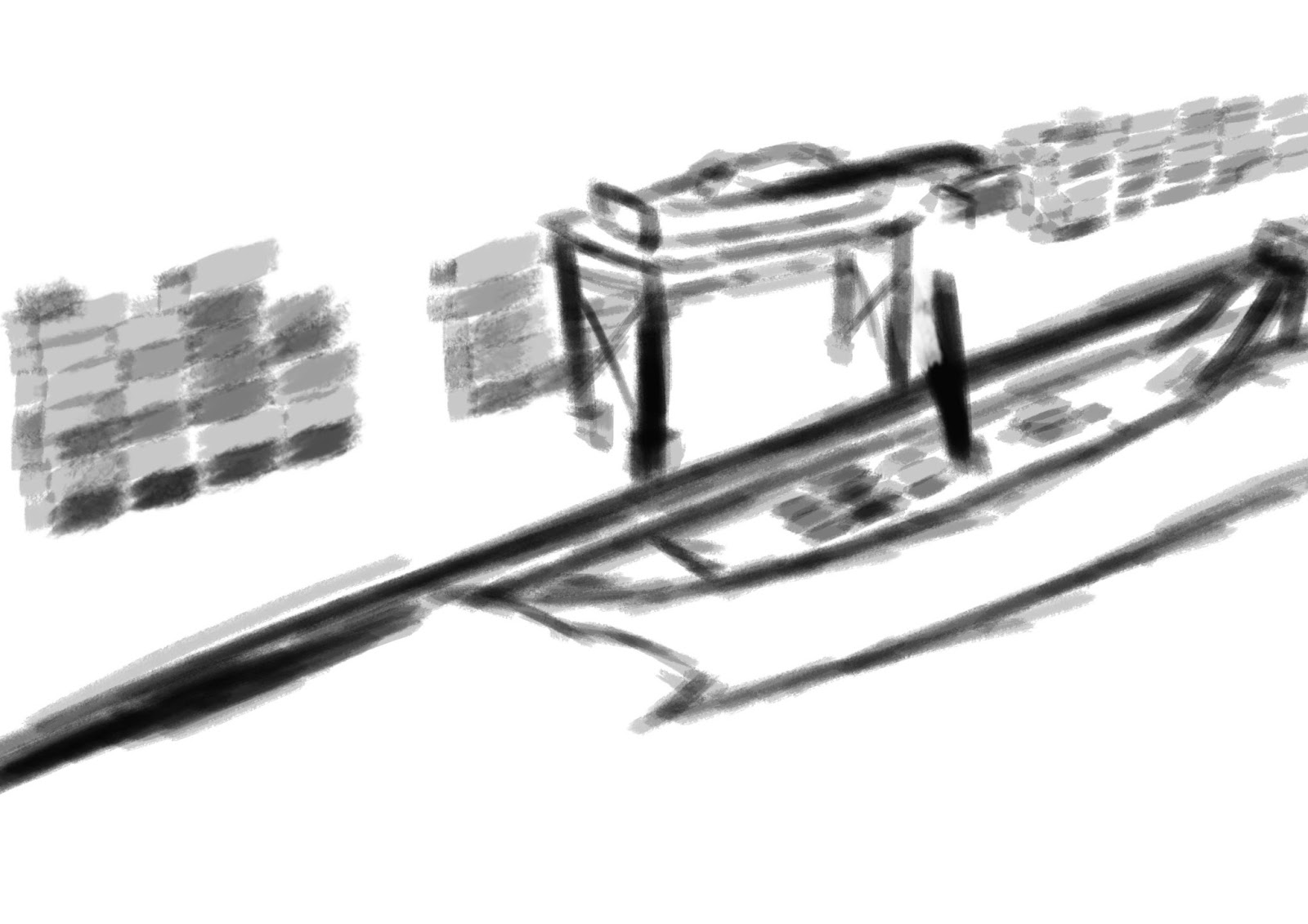
- underground layer
Made may layers will always have some sort of support such as pillars, they are most commonly made from concrete.concrete is the most common material used when constructing building because it easy to manufacturer and strong.The under layer being made will have pros like computer or decoration depend on what type of under layer, a bunker will be heavily protected and can have multiple layer with security cameras and large doors.
For these 5 idea I created silhouette and sketches using my mind maps to see all the possible silhouette and sketch I can created. this will help me narrow down my final idea into what I what to create for my final major project.
space environment silhouette
- futuristic soldier
A futuristic solider will require weapons but that dose mean it need to be show.I also determine how far into the futuric it would be, I can either go few from now or hundred of years from now.
- urban environment
an urban environment is any thing man made going from city to industry that can have people populating it or be abandon.
space environment silhouette


underground layer silhouette


Urban environment silhouette


superhero silhouette and sketches


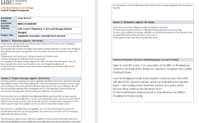
Project Proposal


Research on vigilante
I chose to create a vigilante charterer because I read comic book featuring vigilante character in my own time so I am interested in them.
As I am creating a vigilante character I needed to research into what a vigilante and other vigilante characters that have been created.I also needed to consider everything about Comic vigilante character such as what they wear and what they uses.
A vigilante is a person who takes the law into there own hands by using violent to commit vigilante justice. Vigilante is a Spanish word that translate to vigilant and originated between 1825-1835.
Superhero are fictional character that process superhuman or special ability to protect innocent people and fight crime.The difference between a superhero and that a vigilante is a vigilante usually works outside the law against law enforcers to see justice where as normal superhero work with local authorise figures.
The first every superhero was in 1897 called Spring-Heeled Jack he first stared as a legend by the people of Victoria London. during 1837 mysterious figures started appear around London and terrorising people with attacks
fiction comic book character research
superhero vigilante usually does not have extraordinary power, instead they intend to use special equipment.A superhero Vigilante equipment are mostly none lethal like tear gas and bow staff although these are weapon they are non lethal.However this dose not mean vigilante only carry non leather weapons ,superhero vigilante carry non leather weapons because they don't intend to kill their enemies but there are some like green arrow that uses bow and arrow but is able to use it a way that dose not kill.However some vigilante character from comic book likes Punisher and Red Hood use firs arms and intended to kill because they are more dark and have unpleasant backstory or origin. firearms can be made non- leather as well by using rubber bullets or taser and other weapons such as sword can used non leather by only cutting or with blunt force.
These will also need to be held in something small like for example batman has a until belt in which he keeps all his gadgets with out it being big and heavy.Other character like green have other mean of carry the equipment , because he is mainly an archer he has specialised arrows which he can keep in a quiver.Some will have feature built into the suit for example entire suit not only protect him but come equipped with a wide range of device.Hostel are also another means of carry device, it can used for to carry a grappling hook because a grappling hook is the same shape as a gun that fit perfect in a hostler.But popular small storage capability is a utility belt because the belt is able to hold multiple small storage packs with affect the movement.
Vigilante suit colour have a dark ton this is mostly because it to represent there charterer for example marvel Punisher is very dark character so he wears a fully black clothing but manly it because vigilante are more sinister character however there are some character that are vigilante and aren't sinister so they wear bright colours.Another reason for dark colours is because vigilante manly work at night this is because crime seem to be more active at nighttime then day so it act as a camouflage.
When read a comic book the suit art for the character usually seem like they made from standard normal fabric materials.But in live action we can see that the suit are have more armour The TV show arrow which is based of the character called green arrow, in the comic the suit look standard but in the TV show we see that the suit is made from a Kevlar base martial which appears like leather.
The reason most of the time we see the character abs and muscles structure because the suit are form-fitting. Small pieces of amour plats can seen attracted to the suit in live action and even games.like in the Game Batman Arkam knight we see that suit has piece of plated armoured located on the chest and abs.

The reason they are located there is because it protect the vital organs and it in being attracted to the suit it allows batman to be more agile, other armour are pads that can wear on the shoulder knees and elbow also arm and knee-shin guard. However ever sometimes in comic artist use recess line to represent armour gaps.
The reason they are located there is because it protect the vital organs and it in being attracted to the suit it allows batman to be more agile, other armour are pads that can wear on the shoulder knees and elbow also arm and knee-shin guard. However ever sometimes in comic artist use recess line to represent armour gaps.
Geoff Johns (2012) The new 52 Justice League Volume 1 Origin,Burbank: DC comics
This image is from comic book know as Justice League war

Kevlar is the most commune used of armoured because it is light weight and offer protection but other superhero uses fictional metal for example Marvel studio black panther suit is made from a fictional metal called Vibrannium.
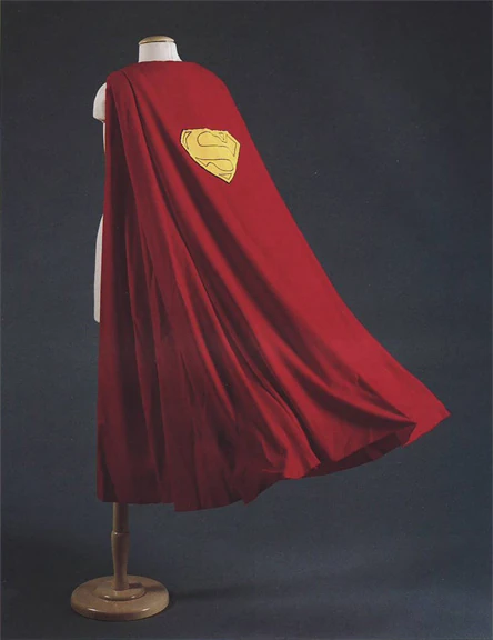
Caps are another aspect that be see used by a vigilante character , at first comic book characters were given caps as part of their visual look because caps represented power.But now they have been modernised for other usage for example Batman is well know for his cape but he uses not only as a shield but also a glided.However they still have there used by character a for there dynamic composition because some caps can made into triangle shapes to look evil and sinister and other can be squared to represent balance.
Caps are another aspect that be see used by a vigilante character , at first comic book characters were given caps as part of their visual look because caps represented power.But now they have been modernised for other usage for example Batman is well know for his cape but he uses not only as a shield but also a glided.However they still have there used by character a for there dynamic composition because some caps can made into triangle shapes to look evil and sinister and other can be squared to represent balance.
the most important thing for a vigilante is a mask because protect there secrete identically from those they fight and protect the one they care about form being used a leverage.Eye mask cover the top half the face with holes them for eye, they usually held onto the face by a sticky substance on the inside of the mask or by a strap that goes around the whole head.but eye mask only offer little protection were as a cowl cover the top half of the face offering more protection for the face and room for the mouth.Also a cowl can be more design on it then a small mask,such as patterns and can also have the superhero symbol and can hold feature on it like an superhero character called daredevil, he wears a cowl that has two small horns.this is done so he look more like the concept of the name he has also so character uses these feature for intimidation.

Batman is a perfect example hes cowl has two ears on the side so he look more like a bat.bats are scary looking creature and batman use the same of a bat to inflect fear on the people he fights.
this is stated in the movies Batman begins in which christian bale the actor who plays Bruce Wayne (Batman) Used the look of the Bat to inflect his own fears onto his enemies
Artist
Jim Lee

Jim Lee is a illustrator for Comic book industry like Marvel and DC, he has done art for 35 different books.He many art focus is on superhero comic books like justice league and X-men this is why he art work fit in with my project character. In his work he put in details by using recess lines to show joints in the suit the characters wears and he has uses of depth.
Mike.S.Miller

Injustice series Gods Among Us

The Injustice series is a DC comic released in January 14 2013 written by Tom Taylor and art done by Mike.S.Miller and has over 200 chapters.The comic is about High moral superhero knows Superman losing his morality and becoming a tyrant after he was tricked into killing his pregnant wife and the story still continue to day.I plan to follow this series art style because on how the armour set for character are design to look eye catching.
assets resarch
My charterer will assets such as protection and equipment so I will needed to research all the type of assets I can see my character with.
Helmet
 The first know helmet know to be created was in 900 BC by the Assyrian soldiers.The helmets they used was made from a thick leather to protect them from blunt object , sword and arrow in combat.Helmets now are made more lighter and stronger because they used a plastic materials like Kevlar and polycarbonate
This type of helmet is know full face helmet because it cover the initiate of the head and face. Helmets protection you brain and head from impact by absorbing the impact force to prevent injurious. Helmets design have plastic shell on the outside and with foam inside as well a strap to help just it to fit to keep held on.Other helmets like motorcycle helmets come with a visor. visor are to protect the diver face from leafs , bug etc when driving with a motorcycle.
The first known half masked where the Masquerade Mask, the Masquerade original where worn when attended the masquerade ball in 16 central renaissances Italy.there were different type of masquerade mask, the Colombia mask is a Half mask that coverthe eye, cheeks and somethings the nose.Half mask today can also be know for cover the bottom half of the face to used for respirator.Half mask are made from different material, during Masquerade times the mask where made from hand and technique was used were paper was soaked in glue and then layered.Sometimes the mask made from leather, wax or valet and then decorated by artist using feathers , jewels or other materials.
Face Mask
Face mask main located on the front of face and normally used to disguise the person or protect one face from cold weather.Most face mask are recognise for the cream that get applied to face to maintain there beauty.
But the common wearable face mask are balaclava, they are made from lightweight fleece and are pulled over your face to fit softly around your face.Mask like these are usually made out of soft light fabric so it dose not hinder your movement and the a large hole are created for the eye so there little obstruction from the face mask.
Cowl
Cowl are large loses Hoods that cover the head and neck.they made out of kited wool to protect the person neck and head from the cold.Cowl also has religious use as they where worn by monk as apart of there robs during medieval times.the monks cowl was made from medium weight cotton and they are fasten with a close front. However ever cowl mask like those worn by character such as batman or daredevil used to protect the face and counsel their identity,but with the mount area still revealed.
Hoods
Chest Plate
Chest plate it is a piece of amour that cover the chest and the back in medieval time it was know as a Cuirass. Chest plate only cover the top half of the body and where supported by straps that went above the shoulder and around the body.Chest plate amour insure that the person wearing it would not receives struggle when bending there body but sometime chest plate armour can extend to the stomach. Historical Chest plate like during medieval time, knights chest piece were created from steel and iron to protect against arrows, swords and lances but other material are used such as leather and fabric.Modern chest plate amour can be made from Kevlar or carbon fibre because Kevlar and carbon is very resistance and light for solider to wear.
Armour plats
Armour plats are metal covering that are used on both people and military vehicle to protect one in combat, they come in different size and materials.Modern day amour plats can be found in body armour made from Kevlar and used to protect from firearms.Armour plats also comes in steel and iron but they only for vehicle because the steel and iron can be heavy, during medieval time knight armour has made from steel armour plats which weighed 110 pounds.
Shoulder Armour plates
Shoulder plates are small protection pads located on the top of the shoulder and overlaps around the shoulder to cover the front and back of the shoulder.They are made from metal , leather and modern day Kevlar and be made as singular plates or multiple plates that extend down the arm.Shoulder plates and held in place because they attachments to the chest armour or they have straps that go around the arm, the straps do not wrap around the arm pits because it would cause irritation.
Elbow/knee pads
Elbow and knee pads are padding that offer protection that is also used in normal people as well as the military. People used the padding to protect their elbow and knee when riding bike or motorcycle
Arm guard
utility belt
A Utility belt is belt that container main equipment and weapon used by the person, the storage capability of utility bet use is the same design as a pouch.these belt are used by police and construction works to carry there equipment around while they work.
holster
The holster was design for holding small firearms like pistol and was know as a Buscadero. The most reconsider holster are from western cowboy which were made out leather for people who held firearms
cape
Cape to day are worn as costumes for fashion how before they were more symbolic to show power.There is now precise date to know when the first cape appear.But it is know that they been around for centuries and evolved through the years.Cape were used for mainly different things, monks would wear them but with a hood, some wore long caps to protect their feet from the wet.
munitions pouch
quivers
A quiver is a container for holding arrows and there have been many type of quivers through different culture and countries. Before the quiver the English Long bowmen and several other cultures used a arrow bag which was a cloth bag other versions of quivers were made from wood, fur and leather before the use of metal and plastic.In modern days the quiver are used for hunting and are able to steady carry different types of arrow with encumbering the hunter.
bow and arrow
bow staff
The bow staff is a low tub made from wood or metal and can be long as the body because of that it has a longer reach then other melee weapons.The bow staff originated in Japan in 1600s with a length of 1.8 meters and was in used many different forms of Japaneses material arts.Bow staff are still used today and have been modernised by becoming thinner and made out of metal and are able to folded into a more smaller tube.
tear gas
 Tear gas is non leather chemical weapon that used during riots, the gas is not a gas, it is an aerosol causes pain towards the eye, irritate the skin and could even blind.it was developed in 1928 in America
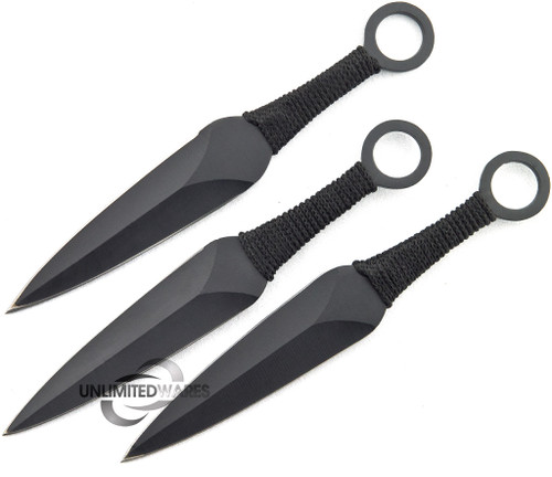
throwing knives
Throwing knives are originated back to prehistory but also was recorded in us Egypt in 1300 B.C, throwing knives are bladed knives that can thrown of over a distance. Although a normal knives can do this a throwing knife is more flat more aerodynamic.
Grappling hook
A grappling hook is hook attached to a rope and can be launch over a distance, the rope is used to attraction a line from the target it hit to the grappling launcher.The know grappling hook were by the Romans to be used by there Navy to hook ships so their soldiers can board ships.But these were large hooks modern day grappling hook are smaller and uses gas pressure to launch the hook over large distance with out cause too much damage.
Human anatomy
Scot Snyder (2012) Batman defective comic new 52,Burbank: DC comics
This image is from comic book know Batman detective comic
 To day learnt because I am doing a charterer and I needed to be familiar with human anatomy I used.the body needed to be a muscular form because the superhero vigilante have strong molecular form bodies.
This guide to help be practise. vigilante usually have strong, muscular figures and I have practise giving the legs, arms and torso muscles.
The guide I used showed me that I should first start off with thin line to show where my are going to be but when Before doing the line I create a large circle to represent the shoulder.then draw the line to represent the upper arms then stop when I reach the elbow then draw a smaller circle.Repeat the same process for doing for the lower arm, then I needed to do the shape of the arm.Started from shoulder circle connect it with the elbow circle with curved line, the side that point away from the body should be more straight then the side point towards the body


I use this technique to do my body and following I feel more confident with on how I draw human body.
https://destinyfall.deviantart.com/art/Basic-male-utter-body-tut-84839144


Observation drawing


I combine the the two pros using the camera as the base shape for the grappling hook and then using the chain hooks as the hook it self.

I did experiments using all the research I did on what my characters would wear,these are my experimentation that I did on different features that my character will be wearing, most of these accessories are mainly of shoulder/knee pad and armour to offer the protection and to wear,these will help base what my final design should be on and I will further decided if should have these blend in with suit so they stand out less.
primary research source Images
These are images of action figures from a comic book shop, I used these to help get a better idea of what my character will wear.


Experimental sketches
I decided on using an armoured set instead of than simple tight clothing because armour set are visual more interesting to look at.
these are knee pads which can also act as place on my characters elbow, I did a few that only protect the knee and I did other that have extra protection coming out to cover the legs.This extra protection can also be attached to my characters foot wear.The main central armour of these can also be represented as the elbow pads but without the extended armour.
Experimental sketches on knee and elbow pads

next I experimented with shoulder pads, the first one cover the hole top of the shoulder the rest can be can be seen mostly on the side of the shoulders
Experimental sketches on shoulder plats


Experimental sketches on chest piace
my concept character suit will have an under layer, that under layer will normally be form fitted , which means it will be thigh that why we see the abs of a character in comic books.But sometimes we see that live action that the character suit has built armoured plates, that are place inside between the clothing, Other times they are attached on the outside of suit and are exposed.The amour can be from from a Kevlar or other dense material.
I choice to do armour sets because vigilante need some form of protection in which thigh and spandex can not give. Protection is needed from them because crime fighting is dangerous and can offer fire arms and other weapons are used,so with the uses of Kevlar armour the character could be easily killed.only movies and people cosplay spandex and other material like latex because they are thigh and easy to obtain unlike material like Kevlar.


The gloves can come with small little padded protection.


these arms guard will cover the wrist and can stretch from the hands to the elbow


Recess lines
Recess line are used are gaps between armour so the people wearing the armour are able to move their body.If armour did have recce line they would be sold and could hinder the movement.Artist use recess line in comic books to show their clothing is armoured and offer protection. Recess line can also been see on the armour of vehicles
Geoff Johns (2012) The new 52 Justice League Volume 1 Origin,Burbank: DC comics
This image is from comic book know as Justice League war

Material
the research on material we help me determinate the texture look of what the my character will be wearing.The most common plate that is used is Kevlar, although Kevlar is what mostly commonly used as material to make the suit out of.Kevlar is a type of plastic with very high tensile strength that was develop by a company called Du Mont
Kevlar has a tensile strength that is 8 times stronger then steel , this is because molecular bond form together to make a bigger molecule.
Kevlar is used to make belts, reinforcement materials and parts for aircraft ans ships hulls but it is mostly known for the main bulletproof vest, helmet and other military equipment.Kevlar fibre can made it to a suit for racing drivers, but same Kevlar suit can be seen it TV show like Arrow and Devil Devil where they wear suit made from Kevlar.
Kevlar body armour suits don not usually use the Kevlar as the fabric to make the suit.Kevlar suit could have Kevlar plats sown inside the suits.But there such a thing know as Kevlar fibre which Kevlar in a fabric form which I can used as the material for my charterer suit.The difference between Kevlar body armour and Kevlar fibre is that Kevlar body armour is used mainly against firearms and Kevlar fibre act as a material for a suit and can protect against impact, extreme heat and from chemical attack.
This is my interpretation of Kevlar fabric
I used the watercolour brush on dry surface brush , this brush paints mutilate small lines and I used to paint my Kevlar texture by turning down the opacity to 20 and flow to 25.then I brush down in a 45 degree angle.

My character helmets mask will need protection for his eyes,something to be place on where eye will be located on the mask to cover it.the closes thing that to eye protect that doesn't completed cover the face are bullet proof military goggles.These are class sun glass but they are design for the military, the frame is made from plastic where as the lenses is made from Polycarbonate
Polycarbonate is a Transparent Plastic which was discoverer in 1898 but was fully put into production until 1953 by a company called DSM Engineer Plastic and used for power tool, babies bottle, water dispenser,Traffic lights and mobile phones. Polycarbonate is 250X stronger than glass and half the weight make it highly resistance from impact light weight which make it perfect for military eye wear.
I want to show that my character has been a vigilante for a while , I can do this by showing that my armour has used giving it starch marks and dents.The scratch and dents will show that the suit he wears is not a new fresh suit, it show that it has been used by him.This detail also fits in with artist influence because I am following the Artist Jim Lee on his use of detail in his work.
I accomplished this my first paint the background the same colour as the armour plates then using lowing the opacity and flow to 10%.The brush I used the sponge tool and I shaded the area that would have the mark with dark version of the armour colour, then I shaded in the middle with %1 opacity white brush so the middle would have the white mark that a scratch given and edge would represent the dents.


Developing armour sets
Mask
I decided on the helmet instead of the type of mask because they seem more sinister to me and more intimidating if you can't not see he's face.
I chose this cowl it most intimidating and being intimidating is a aspect used by most vigilantes.
I also find the lines and interesting feature to the design, they reminded the lining features on the Iron Man Helmet

This is the iron Man helmet as you can see it has line feature this is know as recess feature which means a small space created between things.They main purpose is act joint to show where different piece of martial and amour are located.
This face mask I found very sinister because the mask cover the face so we can not see any expressions making the character look emotionless.The other mask experiments had the eye location open so my character can see out of it but his one has a ballistic glass cover the eyes.So I will combined them together by using the same design and look the top experiment but it being covered with glass material.

That sinister look remind of a DC comic characters called Deathstroke his helmet covers his entire face covering any expressions and giving him a sinister look.

Helmet development process
Using my sketch experiment I combined the cowl and the face mask by using the helmet as the base structure and still sung the recess line that come with it.I also kept the eye because they kept within that sinister look but to make it seem even more sinister I cover the the mouth area with the face mask.I also kept the shape of the face so that my character has room to breath when wearing it.
The eyes use triangle shape because they are suppose to look evil and triangles represent a evil look because of its Sharpe points.The combination of circular head and triangle eyes give in dissonance atmosphere.

Helmet development process

In this development, although the colour need refiling this is first process but looking at some of the colour give me a good idea on how to process further.Other developments will being refining the helmet and apply more detail to the helmet.

Helmet development process
During the refining of this helmet I found that I was struggling with doing the depth with the dark black colour because the white I would use was too bright and black colour would be too dark so they would overlap each other too much.I ask one of my colleague to assist and he suggested lowing the opacity to 1% when using the white and going over the dark on where the light are of depth detail would be.

I soft the texture look by using a smug brush and slowing going over it with a dark grey colour so the colour look more like a Kevlar texture colour. I lighted the check area with the low opacity white technique I learnt because looking at where the lighten from my previous development I could see the light source coming from the top left.This meant the side of mouth area would be hit by the light, this help to show the depth of it.As for the eyes I cover them with a grey texture to show that they would a covering made from the Polycarbonate.

For this I increased the light that was hitting the helmet with more storks from a normal soft brush by still using the 1% white.But with the increase of light I increased the shading, the first of shading was on the back check area and the bottom area of the top check as if it was a cowl.Also for the top check I added light and applied black around the eyes, this is to show that this part goes over the the check. The extra detail I added was that I included recess line that start from the eye and go around the helmet, I did the recess line using hard brush and then stroking it on where the the line will be located,Then I added small amount of grey in the middle.
The glow of the eyes I find to be very intimation and sinister so it fit in with that Vigilante fear giving aspect that I go for .Look at the mouth section it showing me that it goes more loses and goes over the mouth then being be thigh in the previous developments. The small detail of recess line

The glowing red eye are a feature that I included for intimidation because vigilante in comic books used fearful intimidation to scare there enemies from committing a crime.I decide to do the same for my helmet by adding glowing red eyes,I choice the eyes because that is usually the main focus point you look and the colour red represent something evil and sinister.
I am pleased on how the eye turn out I believe they the helmet look more sinister like the reference image show of an character. Also the recess line add more interest to the helmet , plus the technique I used for the also help do lighting on the top of the helmet with eases.If I had more time I would correct the shape of the helmet because it is face in angled direction so will needed correct the shape of helmet.
Helmet development process
Finished version
For this I correct the shape and look of my helmet by first creating a guide in which I used the right side of my helmet and highlight the edged in a high contracted red.the line went circled around the right side of the helmet head following outside the detail line and check.Then I copied and the guide line and moved it to the left side of my helmet just touching the side of the eye.Using the guide I erased the part of the helmet that was out side the line.After that I moved the face mask so I would be face the correct way by using the lasso tool and cutting from the chin up just outside the light area and then following the dept line toward the corner of the eye and over the the top of the nose, then back down to the chin.The check still needed correct because it was still the same size and structure from the previous development, to correct this I used a 12% low opacity eraser and starting from the check area that stick out and brushed down in curve motion towards the chin of my helmet.The final process was to compensate for the lighting so I dark then check lines and added more light with a 1% opacity white soft brush and went over the face mask to show that area sticking out.For added detail I included two more recess line on the top of the helmet head that reach the top of nose also there are small brushed line located on the top of the eyes , the eye area stick out more.

Helmet development process
Once I completed the main part of my helmet I did some final correction and detail that were needed.First erased any line or colour that come off the helmet to neaten up my helmet and for the left eye small I erased more of the eye with soft brush and curve formation so it fits in with the angle the helmet is facing.
I am pleased on how this final version came out because the head shape has the correct proportion then the previous developments.I also pleased the recess lines because they give the helmet an interesting design feature and still keeping that armour protection look.If I hand more time I plan on creating a full turn around to show the entire helmet however if I did do this I would not have less time to go other sections of the armour set.

Colours used
This is colour I used on the helmet, I used dark colours because vigilante character wear dark colour to help them camouflage themselves at night time.In colour theory this is know as desalinisation and used to represent sadness. But for my armour the uses of red and dark colour also represent his mood which is sinister and intimidating, the dark colour and red work well together because in colour theory they are very evil colours when used together.

Torso development process.
These are torso design I did which I found the most interesting
For this the small line curved armour that goes around the waist because they would fit in with a design look to added to the interest look and also offer my character protection.

For this what interested me was the chest piece that fitted on the chest with having to go around the whole body.It also has a part that cover the top of the chest which meet up toward the shoulders and stayed blow the neck.this mean Once I starred my full body the chest armour would fit closely to the should pad armour.

I combined them both in my sketch and came with this, I drew a torso body using the guide I found than I included the line armour that is located on the waist and for the chest plate.I
Placing the picture in the Photo shop I traced over the body first doing the body and then over the armour itself.Them with a hard brush I painted the torso with a dark grey and for the armour covering I used a lighter soft brush grey then I highlighted and darken parts of my armour to show depth and gaps.


I increased the under layer visible and before doing the Kevlar fibre technique I used a low opacity brush with black colour and then started to give the body abs to represent that strong superhero vigilante by dark the parts between where the abs are located.Once I had compete the abs I applied the Kevlar texture on the entity of the under layer.The armour line were darken to represent joints and the top part of the armour was darken to show depth and for the waist amour the front was given small stoke of white to show that light is hitting it and also to represent that it is not completely flat and also follow the art style of Mile.S.Miller Injustice series art design because the armour comes out and is eye catching.

In this development I smoother out the outside of the under layer with a low opacity brush and applied a dark grey to armour .I also added light that come down from the top left , the light reflex on the top left of amour and only highlight the top half this is to show that the chest armour curves around the chest.The waist armour plats look too straight so to make it look more curved a used a erased tool and erased in the top and bottom of the plats with a curve motion.The gaps between the abs needed more depth to them I increased the opacity and using a very brush, went over the the abs I already had.The only this I would change is that the body seem to squad so be a human body because they are usually around
At the current develop I am please with how they chest piece look because it has the correct look of armour and act as a chest piece and detail of abs show that the it is being worn on a body.The shin on the armour it self give it it shape hard look that armour of an chest piece or hard metal. I am also pleased with detail design on the top of chest because It added more interesting visual look.

In this development the shape of the torso was too squared and I it needed to more curved , the way I did this was using the erase tool deleted a small amount of the right side so the side line up with chest.For the left I erased in a curve motion , the brush I used to erase was soft brush at 20%.The underlying of where the abs were located were too dark so I went over them with a light grey while avoiding gaps between the abs.The waist armour plats needed more of a 3D look so I used a 3% opacity soft brush and brushed on the corner location , the waist armour on the right side also needed correction because it did not fit with body correction I did by erasing using a circular motion and slowing erased until in reached the correct look. Furthermore on the top of the chest piece I include more detail with recess line to added to interesting look.

For the final completed develop the first thing a started was on waist armour using the circular motion technique I did for my previous development.Then processed on improve the texture first by smoothing out the shinning light on the amour with a smudge tool.I also increased the amount of light that was on the armour by added some on the left chest plate.the bottom of the chest piece had a under skirt but it would over laps over the abs so it would seems that the armour has loose.I corrected this by reduce the length of the under skirt so it rest on top of the abs and seems more thigh then loose.For the abs I reduce the wept of the gape line between the abs so the under layer is more thigh. Finally I added three scratch marks texture on the right chest plate and straighten the wist amour line.
I believe this final develop came out very well because it keeps the look of a foam fitted suit suit with the a correct body shape so it dose not look out of proportion.I also find the small detail of scratches a interesting feature because it shows that it isn't new and that it has been used.To improve the development of it even more I would add more scratches and perhaps some damage that revel the inside of the armour plats.However I can add these detail when it come to final main turn around character because this development give me an understanding of what my character will be wearing.

Torso colours
These colour follows the same monochromatic grey colour but with red the only bright colours are shine on the chest piece.


Belt development process
These two experiment are the one I found interest for a belt because this one has the


I first place my sketch of the belt in Photoshop and using a soft low opacity went of the lines just like previously with the torso and helmet.I coloured it a light grey to match the armour chest plate and applied dark black shadings to show depths and detail such as the joint of the belt buckle.The shading of the top of the storage feature are to show how much it sticks out and how it shapes.I decided to make it look more circular and curved to give it more of an interesting look rather then a plain flat top.


For the final development of my belt I notice that the bottom parts of the storage area were too light and would look as if there was nothing there.I corrected by simply using a dark brush but I did not want to make it too dark so I lowed the opacity to 8% and applied multiple strokes to the bottom section.After that the only part that was left was the back which was simple, I added another outline to represent the bottom of the belt and then coloured between the line with same dark grey colour .
I found competed version more interesting then how my sketch originally planed it, because the sketch showed a flat angled top where as the final shows that the top is more curved and in.This give more me confident if I decided to change certain look in other developed so I do not have to stick with same look if I decide on something better.Luckily I am still happy with my other amour develops so will not have to change anything on them like I changed here.If I was to develop this further I perhaps apply more feather to the inside of the belt but overall I am please with how this turn out.


Glove development process


In this development I added the depth line detail to the bottom of the finger armour because if the whole fingers were covered in armour there would be no way of bending the fingers.I then added the same detail to the top of the figures and then applied small little armour on to the top of the finger joint.
at first i thought the armour pad on the top of the hand was too small but I realised that the it needed to small to stop hindering the hand.However I am happy with the figure having the armour colour because provide protection without look out of place. Any further development I would mostly likely apply more little plats with more details.


Shoulder plates develpment process
I choice this one because it has the simple look because the shoulder plats do not always needed to highly detail.It also curving so it goes over the front of the shoulder .

Four this the I was more interested in the top one of the plats, on how it curve over the shoulder bone and the top of the shoulder.


doing the same process from my other developments going over the outlines from the sketch I did and then placing it in Photoshop.First using the same dark grey colour from my chest armour in 20% opacity I cover the top of the shoulder with the dark grey and applied the lighter grey to the side that will cover the front of the shoulder.There is a small black line that sit between the light grey and the dark grey to show where edge will be for the top of the shoulder plate.

The only correction that was needed was that the front of the shoulder plate were too short.I corrected it by fist drawing a outline so I had an idea of how big it would be and what the shape would be.I then applied they light grey by using an eyedropper tool so I match the same colour,the applied the paint. Finally I reduce the visible of the edge line with a low opacity erase because the dark line did not fit it with the shoulder plate.
I am pleased on how this turn out because it still follow that simple look with being boring during it shape.If was to develop it further add more detail like recess lines but for now I am happy with the simple look.
knee pads development process
the elbow will not have the extended part because the arm gauntlet will be place on his arm.


Because this was only armour I used only one main colour to which was the grey that represented the armour.The only other colour that was used is black to show depth and to do shading.I applied shading to the top and the bottom of the knee pads to show that it is separate from the leg armour.
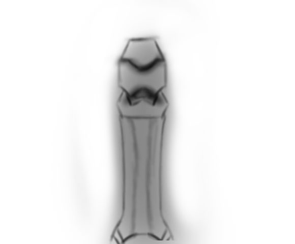
I am pleased with final development because it following both artist i am influence because the knee aspect has and interesting look toward it and the way it come out make more eye catching.If I had more time I would added another extension so there would a armour covering the top leg

Elbow pad
The elbow pads and the knee pad will have the same look and design as one another,the only change that is needed is that legs armour.There will be no armour for the elbow pads because the my character arms will have a arms gauntlet that will cover it.

Arm Guard development process
I decided to used this as my arm guard because I feel it follows more into the design of arm guard due to it simple design.

Following the previous develop process I pace the sketch in Photoshop and coloured it with the same monochromatic grey colour of the armour so it would blend with the set.The using the erase tool to keep the colour in the shape of the arm guard.I then gave the dark shape on the side and kept the the top a lighter shade to show which parts is going to angled.

In this development I applied the light grey to wear the metal armour parts are going to be then.for the edged there is a black shade to repent them.I kept the bottom part dark because that would what hold it on the arm and made sure it was soft so we can see that it is movable.I added a sloped to all sides so would not seem like a flat surface that offer no protection.

Overall I am pleased will the outcome because followed the correct aspect of an arm guard which is to protect the wrist.If I was to further develop it would apply more detail


In the first year of this course me and colleagues in level 3 did a project on Pre-Production concept art.We learnt about visual weights , leading lines, golden spiral and leading lines, these are use by concept artist.
We see that on the helmet eyes are dominate form because they are the most contrasted feature on the helmet.In concept art this is know as visual weight and dominate forms, dominate forms are what we instantly notice when look at a piece of work.We also see leading line on helmet, leading lines are line in art that direct us to whats know as a focal point. Focal point are similar to dominate but they demand the most attention I believe the eye are the focal point because you would natural look at the eye of anything.

Pose sketch
these are poses I have done to base what make character look like in my final piece.These were done on a sketch book because I find easy to sketch on sketch book because paper is more free and loose than Photoshop. Lucky I used the guide technique so the body would have the correct peroration.

Reference Image

This is my reference image of my pose, i used this image for my character pose, to help me accurately draw the hand in that position.
Character development video
This video show all my process of my whole character develop, unfortunately for the start of character develop the video was corrupted and was unable to be viewed.This video is 16 hours compressed into a 6 minute video.the whole process was done in Photoshop
The first process of the develop I used the sketch of the pose I did on my sketch book and placed in Photoshop like I did with my armour set development.I lower the opacity of sketch image and used a soft brush and new layer to go over the body line that shape the body.Once I completed the body I then mapped out the armour using different colours; the chest piece and knee was done with a blue the shoulder and arm guard were done with a red and I used green to show recce lines.I used develop image as reference so would be ore accurate when I drew these set on my character.Once I had all my guide line I could start painting first starting with helmet ,colouring the dark grey and then using shading to show depths of the mouth.After I coloured the entire body with grey to represent the under layer.Then apply the light grey on the chest piece over dark grey and uses black to shade in the middle and to show depth in the chest piece.
During the 30 second mark the other video become corrupted as well, but in process go on to doing the waist armour, the shoulder plats, guard and the gloves. I followed the process on developing these armour sets on my character the same I done the development for them.However for the arm guard the arms was angled so I had to compensate by apply shades of black on the location were there would be no light.During the process I applied recess line on the arms and I did not manged to get the legs in the process.
final completed piece
Unfortunate I was unable to do the whole turn around because I underestimated the amount of time needed so I decide to focus my effect on the front develops.
I happy with how this has turn out because it has a sinister look or comic book character and I can see that the detail and design make the it look more interesting.
Only development I did that was not record was the darkening of the armour because I felt that it was too light and needed to dark because he needed to be stealth when fight crime at night.I also added more dark grey to the sides of dents so they would be more visible because the darker armour overlapped the dents edges.
If I had more time I would develop the full turn around and added assets such as gadgets hanging on his belt

Evaluation
The project was my final major project and I give
independence to create my own final piece. It could be either a 2D art work
create or 3D model but main object of the project was to test my independence.
I choice to created a superhero vigilante comic book character using Photoshop
that is 2D but has various 3D aspect like shading and depth.
My influence were the comic book characters and superhero
movies I watch during my leisure time. An artist that I was influence by was
comic artist named Jim Lee because he put high amount of detail making it look
more interesting. Another artist that I was influence by was Mike.S.Miller
because in one of his series called Injustice the character suits he paint
stand out like amour rather than the normal look of simple thigh clothing which
made more eye catching to the readers I used that same aspect in my work.
Follow these artist meant that I was following the art style of a comic book.
Another influence is issue event happen cinematic movies with a superhero
coming each year by two different comic book companies.
The research I did was on comic books vigilante character I
used internet and comic book to I first wrote about what is a vigilante and who
the first vigilante fictional character was so I would an idea on what make a
vigilante. Then I wrote about what comic book vigilante use, what feature they
have and why they have them; Thing such as equipment they carry, what they wear
and the tone of colour because would be thing that would feature on my
character to understand why they have carry these or why they have these
designs on them so I can experiment with them make my own. My secondary
research was on all the assists that would that could feature on final piece I
used comic book I process at home and the internet to talk about the assists
like different type of armour and equipment. The comic books I used where on
character like Batman and green arrow they related more to the character I was planning.
My primary research was originally was going to be of superhero suit in glass
container which planned to take picture of at comic-con on April 28th
however there was no suit being displayed. So instead I gather primary source
image of action figure that are displayed in comic book shops to help me get a
better understanding what to base my design and experiments on. Another primary
source image was for observational drawing for a grappling hook and another was
a picture of my hands to help drawing hands in the position wanted because I
was finding it difficult to draw the hand in the pose I wanted. All these research
were useful helping understand because the assets help understand how they
would work so I could experiment into making my own. The experiment were very useful
because they allowed to expanded on the design of my character instead of
staying one on idea, then I would take the one I find interesting to combined
the parts I find interesting to something that applies to me. All my experiment
used influence from comic book character and I used primary image of the action
to help base my experiments on.
I painted my character in the style of comic book because I
was influence them and also interest me. I followed Mike.S.Miller Injustice
series art style because I wanted the armour I created for my character to be
eye catching rather than flat suit. I also followed Jim Lee art style which was
to make thing highly detail so that it would seem more interesting to look at.
The similarity between these artists is they both work in the same genera which
is comic book but the difference is the style they work in, Jim lee work is
highly detail compare to Mike.S.Miller making it more visually interesting.
The material I used was my sketch book to experiments
because I feel more free and loses when drawing on sketch book compare to
Photoshop software because for Photoshop it required a tablet which is more
rough then sketch book paper. I found it the paper very affect material for
when doing the human body because I could following guide technique I found on
the internet which little difficulty, This made easy for me do draw bodies in
posing he is in and do experiments
The software I used was Photoshop to finalise my experiments
and apply the detail that could not have been done on sketch book and because
the tool and technique, was very effective for doing my final piece. The art
style I painted my character in is comic book style because it what I was influence
by and it relate more to my final character so it meant I had to follow semi
realistic look with a Sharpe because comic book character sharp look towards
them. I used multiple layer for each section of my armour and texture or detail
that was applied so I could include more feature to section I wanted without
affect the other parts. This help me to apply texture because I learnt
technique and I could use new layer and editor in ways that would not affect
the other layers. I developed a technique for doing Kevlar texture because my
character clothing is made out of Kevlar so I used the technique so the suit he
wear would have look of the clothe he is going wear. So develop the Kevlar
texture technique help me insure that I would have look I needed with much
difficulty The way I did the Kevlar texture was using the watercolour brush on
dry surface brush and lowed the opacity to 20% and the flow to 25% and brush
down in a 45 degree angle I used image of Kevlar fibre to help interpret the design for my technique. Other technique was one I developed to help me show
dent and scratches on character suit because I wanted to show that the suit has
been used and been damaged. The way I develop the technique was first matching
the colour of the section I wanted to place the scratch or depth with the eye
drop tool and shade darker version of the colour, then using a wet sponge brush
colour in the middle of shade with light 1% opacity brush. So the shaded parts
would seem the like the edge of the dent and middle would have the shape look
of a scratch making it an appropriate technique because of how quick and easy
it was to create to apply to other parts of my character. The depth technique
was effective for me because at first I ran into a problem, went I tried to
apply depth detail .The problem was because of the dark colour I used the white
used to depth would over lapped the dark colour and it would be too white. So
my colleague suggested I lower the opacity down to 1%, and highlight the area
that would be light then the others and leave the area that would remain the
dark. This technique was effective for me because the low opacity brush allowed
me to control how much highlight I needed so could easily apply depth to dark
coloured areas of my character. During the development of my character I used
dynamic composition to represent parts of my character. The eye where based on
a triangle form because triangle form in dynamic composition represent a
sinister evil look and character my character uses that look of sinister for
intimidation. I used that Sharpe triangle look on other parts of my armour. I
colour I used was grey monochromatic colour to paint the character armour, I
used grey because grey is dark tone colour that is more visible then black. The
only other colour I used was red for the eye because red is sinister colour
when surround by dark colour, the red eyes also give the helmet visual weight
so it act as a focal point for piece.
During the project I needed to understand what vigilante so
I would have an idea of what character would like and how he would act if he
was in a game. I also research into versus assists like amour and helmets so I
could visibly image different piece of armour that I design, then I look at
material so I could apply the texture look to my character.
I created my vigilante comic book character but I did not do
the turn around, the reason why is because I was over ambition to apply all the
detail and texture look to my character. That I notice it would take too long
to do an entire turnaround of my character and it mostly would not have look as
refined. So I thought it would be best to focus on the front view and give it
high amounts of detail as I can.
I am happy with how my final piece turn out because it fit
in with the sinister superhero vigilante by using a dark monochromatic grey
with red coloured eyes which tell me that fit in with a concept I was working towards.
I also like how the armour turned out because it is not overly complicated but
the design of the set make look interesting to look and shows me that I followed
the art style of Mike.S.Miller injustice series. Furthermore I am pleased with
the pose because it add interesting visual look more interesting than a stander
A-pose because it make the body and angle more tilted. If I was to develop it
further I would move the arms out so they block less of the armour and so I can
see more of the stronger muscular figure with muscular arms and larger torso.
The way I would have done this by using the lasso tool and selecting the arms
and move it in the posing that is better, then blend in the gaps would appear.
After that apply the muscular features such as the larger torso and large muscles
on the arms.More development for character would have been to give him gadgets such as grappling hook from observation drawing that I did so he seem more like a highly equipment crime fighter.
One thing I do not
like about my work is that some detail like the Kevlar texture is barley visible
so it make the suit look like a plain. What I could have done to develop it more
is that could have applied darker shading lines to the small texture lines so
that the Kevlar is more visible.
Using my current knowledge it was to go back the process
would have been easy because during the development I learnt more techniques that
would have same time. I learnt how to make thing sharper by using a hard brush and
hard eraser to make thing more Sharpe. If then used this knowledge it would
have made the process quicker and easier because previous I used a soft brush and
eraser that made the armour look too soft.
Next time I would give myself more time to do the entire turnaround
of character by 3 weeks, that way I will have more time to each side and I
would have a good understanding on how much time I have to complete one side. I
could also have help increase my time with practical work by doing any sketches
at home because paper can be used anywhere to draw, were as Photoshop has requirement
and a price. All research into all that I needed to when came into my character;
by going into what a vigilante is, the asset that they can used and the material
these can view on my blogs. The experiments I did explored all the possible
design I can thing for my armour sets, I made sure to do enough so would be stick
on final look , these experiment can be view on my blogs, along with combination
of experiments. Unfortunately time management was an issue because I underestimated
the amount research I did which lead to less time for doing the turnaround piece.
Bibliography
https://www.cyclegear.com/gear/bilt-techno-20-sena-bluetooth-adventure-helmet
https://www.cyclegear.com/gear/bilt-techno-20-sena-bluetooth-adventure-helmet
http://www.wallpapermania.eu/tag/hood
http://adcproxy01.corporate.bmet.ad/access?
DFXP06ZTTLF265LKPO9MNRBZ5G40J0SO
https://www.abbeyarchery.com.au/p/BO20260/Bohning+Slip+On+Armguard.html
https://www.gdfb.co.uk/larp-shoulder-plates-dark-warrior-steel-30458-p.asp
https://www.skatebritain.net/187-killer-elbow-pads-12758-p.asp

Comments
Post a Comment